This piece was a redesign of an article in which the challenge was having very little type. I went around this by using a large graphic and headline. For the headline and other colors I grabbed colors from the photo to help make everything more cohesive. Then, for the photo caption, I used an arrow as a graphic element to link it to the photo. I feel this was one of my most successful pieces. I especially enjoy my curved text wrap which I spaced out more from the photo since the original since it used to be pretty tight.

Stressed Out layout: Totally revised. There were lots of issues with this revision. I changed the headline to fix the awkward negative space. I also moved the photo and flipped it upside down and put it on the top. The actual photo cut off the elbows, so I wasn't sure how to fix this. By making the photo bigger I could run it off the page, but I couldn't use this much space with all the copy. I tried to solve this by adding the red bars. I'm not sure how I like this, but it did solve the photo issue. However, it does bother me that the far column just barely wraps at the top right. This spread took me quite a while, especially since I redid it. I like the outcome alright, not sure if I enjoy it more than the original. I do like the headline much more however. Anyways, I like it enough to submit, so here it is!

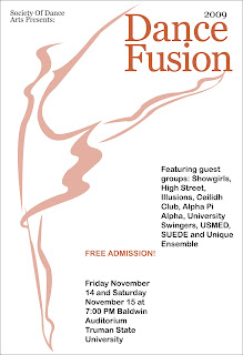
This piece was the Dance Fusion (Shut up and Dance) poster for TSODA. We only did one comp for these posters, and I really didn't like my first one. However, I did enjoy my graphic. Because of this I went back and re-did this piece. This was a b/w with spot color poster, and to make it a little more dynamic I decided to use a different opacity on my headline and my graphic. I used a 3 column grid for the information. I wanted to keep this piece simple yet eye-catching which I feel like I've done, I'm pretty happy with the outcome, especially since there was only one comp.

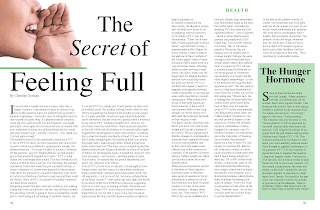
This piece is our recent "choose your own professional photo" spread. This is my article for that photo. I found the photo and then the article to go with it later. The issue with the article is that it was very lengthy, however, with this being brownie points I decided to work with it. I wanted my image to be large so I blew it up along with the headline and used one page for that. I used a pull quote to break up the copy on the second page and imitated the border design element from the first page on the second page as well to add to the design aspect of page 2 since it is very "wordy". Overall I like how this layout turned out. I'm sure there's always something I could do to it (actually I know this) but I'm pretty happy with the product.

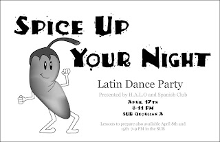
This Latin Dance Party poster was a black and white 8 1/2 x 11. This was the first poster where I did my own illustration, rather than a photo. Some things that I've changed on this from the original poster include the font and the graphic. Before I had all of my font as the display font, but I changed this because it was just too much. I tried to make my pepper more interesting by adding a gradient mesh. I messed around with his body to make him look more "latin dance"-like, but everything I did looked awkward, so I went back to a similar pose that I had him doing at first. I kind of like my pepper's dance move, it's nerdy like he is. I like this piece much better after my revisions.

NAHM, aka Poop Drum. Many many many many issues with this spread. First of all there was the poop drum. I thought I revised this by cranking up the contrast and adding an opaque mask to certain areas, however, when uploading this revised version to the blog it didn't show the transparency on the opaque mask...BAH I HATE BLOGGING TECHNOLOGY! Anyways to I had to do it this backasswards way which was very difficult and inconvienient and involved lots of annoying annoying processes, and this is how it turned out. The other version had a much more intense transparent yellow, this one is more muted but still works. Also, in the background I changed it from the zig zag pattern to these indian dingbats. I like this background pattern more. I also changed it from yellow and black to gray and black to help the graphic stand out as the main element more. Overall I liked how this piece turned out, I only wish you could see that the yellow on the drum is in fact much more vibrant...try to just close your eyes and imagine...great.


